


PATRICK GALACTIC LOGO DESIGN
The Objective
Create a new logo for my brand that encapsulates a wider range of emotion and isn’t so self-serious. I wanted a simpler design that used less blended color for easier use in screen printing applications.
The Solution
Softened the color palette dramatically, added a picture of me smiling, rather than staring, and added a slight cartoon feel to the entire piece.
The Purpose
I once identified solely as a musician and have since developed myself as a multimedia artist. I am known for comedy now and wanted to find a way to represent that. I feel this new logo has accomplished that.
Original Logo
Original Patrick Galactic Logo
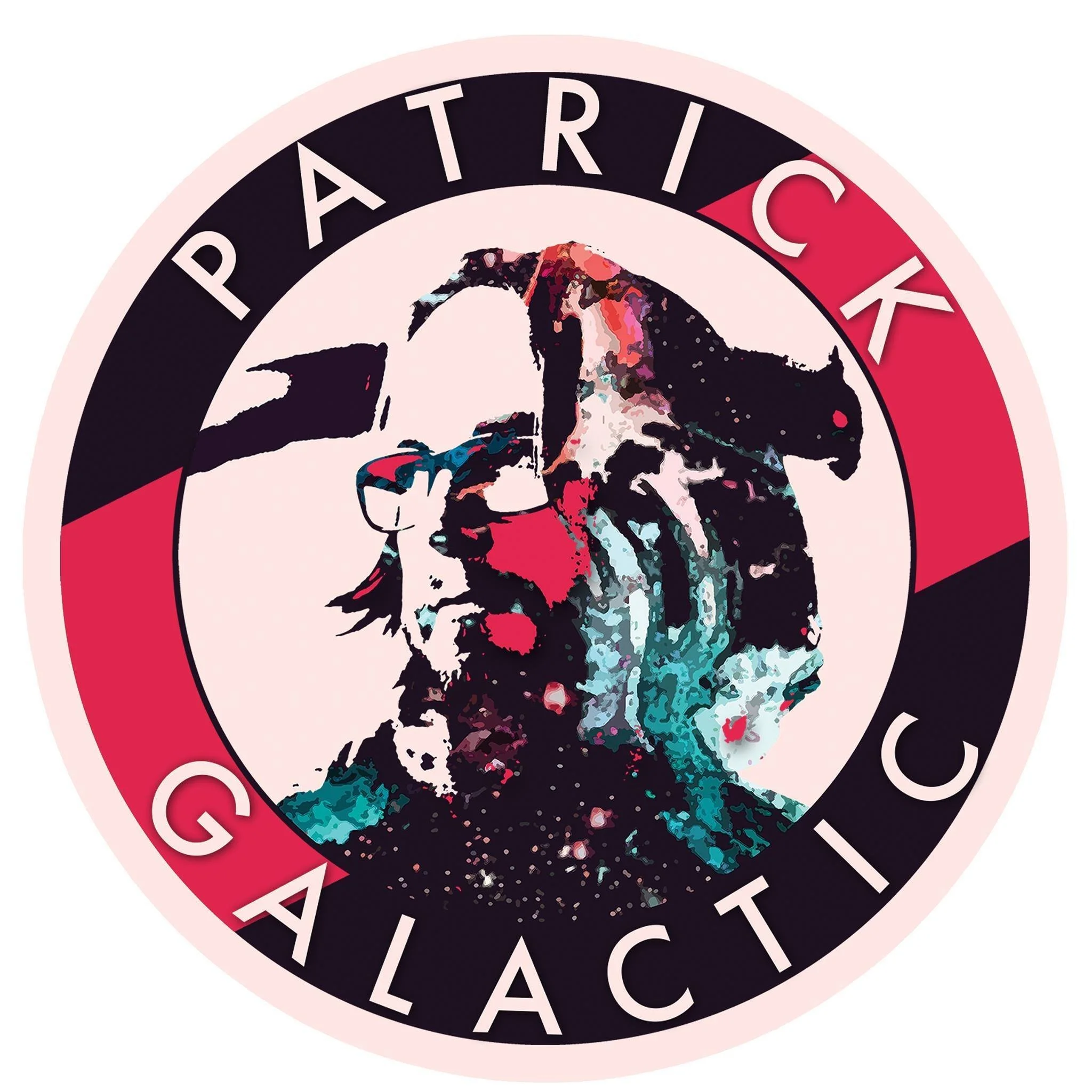
Issues with Original Logo
My original artist logo wasn’t bad. In fact, I enjoyed the concept quite a lot. However, as is easily observed, there are a multitude of semi-tones and gradients in the image. This makes it impossible to print on a t-shirt or any application requiring screen printing.
Additionally, the color palette leaves quite little to be interpreted by the viewer. It is too bold, with true black and very striking reds creating a jarring dichotomy.
I wanted to modify the logo, keeping the circular pattern while softening the color palette and making my pose more inviting to a potential new client or fan.
RESEARCH
While conducting a Google Image search to draw inspiration, I decided to search for “Japanese Color Pallette” as I’ve always loved Japanese design. I happened upon this particular pallette and felt it was a perfect fit. The colors convey a wider range of emotion without assaulting the eyes of those viewing it. Furthermore, it’s not a palette I see used widely so this offered me a chance to stand out as well.
Additionally, I found an image of myself that I felt was a great representation of my current artistic and personal aesthetic.


Original selfie photo of Patrick Galactic, used for new logo.
FINAL LOGO REVISION
PATRICK GALACTIC LOGO - FINAL
After cartoonizing my selfie photo, I set it to black and white to counterbalance the colors. I feel the end result conveys a sense of detached charm. There are colors that are perceived as both threatening and calming together and my unmoved smile conveys a sense of joy and calm, regardless of the circumstance. This was my primary objective in designing my new logo and I feel I achieved it.

Patrick Galactic final logo